This post will have quite a bit of information in it about my recent research project and zine. I will include a link to the digital zine for you to check out, I will answer a handful of questions about the project and zine in general, and then the remaining text will be a screen reader friendly version, though we know that screen readers react differently to different documents and websites so if this does not work for you, there will also be a link to a google document version of the screen reader friendly version so you can hopefully save the document in a compatible file. Any advice or feedback on improving this, please do leave a comment.
~
The digital zine: Are you talking to me?
~
What was the aim of your project? The aim of this project was to speak to a selection of trans nonbinary and/or intersex people in Sussex outside of Brighton and Hove about their experiences of mental healthcare services in general, gendered mental health care if applicable, and their experiences of mental health research, with the underlying aim of providing them with a positive experience of mental health research.
What activities did you do in your project? We conducted an online workshop where we asked questions whilst also providing collaging materials to use during the session (if they wanted to) to show us their experiences of one of the following: their experiences of mental healthcare needs, their experinces of mental health services, or their experiences of mental health research. We also put out a survey using the same questions form the workshop, but slightly edited with feedback from the workshop participants.
What did you find out? We found out that most people who participated in this project had no experience of mental health research. In our workshop, we had 3 of 4 participants who also work or have worked in mental healthcare at some point who all disclosed concerning or problematic views on trans people or gendering certain mental health issues which would put them off from seeking mental health support in these services. One practitioner had been treated poorly as a member of staff by the organisation they worked for. There was an agreement that mainstream mental healthcare services did not have the relevant training to support trans, nonbinary and/or intersex folk and were not trauma informed. These experiences are not uncommon within the TNBI communities and would likely make TNBI people hesitant to participate in mental health research. It was also agreed that participants felt more comfortable with this study due to either knowing me personally, knowing the lead researcher is also TNBI, or seeing that the Clare Project was involved.
What difference do you think your project’s made to raise awareness of mental health research? All participants in the workshop have been informed of opportunities and ways they can participate if they want to, we also discussed a few researchers currently conducting or hopefully soon to be conducting research by and for trans people more broadly in the UK, and the zine will be made available across Sussex for free which will discuss our findings and provide information at the back on REN, (developing trust? communities?) and the research thing… – We also hope that the workshop itself and the inclusion of a creative activity can provide the participants with an experience that they have felt good about and ca pass onto their communities.
What advice would you give to others wanting to do mental health research with TNBI communities? Hire TNBI researchers and link up with TNBI organisations. It was helpful having access to the Clare project’s mailing lists to get the project seen by more local trans people, but it is important to work with people within those communities especially if you are trying to focus on a particular area as TNBI people could be considered a hidden population. I was lucky that I personally knew around 10 trans people based in Sussex who were not living in Brighton and Hove as it is quite hard to target this particular population without knowing community groups or people within the community directly. Not all of them were able to participate in the end and we ended up with much lower numbers than originally hoped. We also recommend due to this to have multiple modes of contacting participants as emails either were forgotten about or went into spam, we had better luck getting participation or confirming drop outs via instagram DMs or text message. Due to low participation, it was made impossible to conduct a workshop in-person as everyone was so broadly spread around Sussex. Most participants said generally they didn’t mind in person or virtual participation, but all preferred this over surveys which people found boring or confusing, and lacked connection. We also recommend creating a group policy or group agreement which is basically a rule book for how participants are expected to behave and interact and how certain behaviour would be handled if it goes against these rules, this is an important step to gain some trust from participants, and providing questions in advance to allow for fully informed consent to participate and make participation more accessible.
~
Link to the google document of the screen reader friendly version of the zine
Introduction to the screen reader friendly document
This is the screen reader compatible version of an art community research zine. This is a text only document. The original format of the zine has a digital collage feel with typed text and inserted images. This version will contain two sections for each page or double page. First an image description of the background of each page or double page spread, followed by “text reads:” which includes the page content – the written content of each page, and alt text passages where any images form part of the zine. Then continuing this process on to the next double page spread etc.
All the content after this sentence is the zine itself.
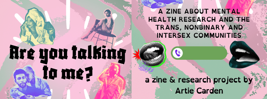
Front cover:
Image Description: The zine is in portrait orientation. The background of the front cover is a plain pastel pink with wide digital painted lines waving down the length of the page. 3 lines are darker but still muted pink, 3 more are pastel mint green and cover some of the pink, the brush strokes are patchier to the right of the page. Across the page over the top of this there is text and pictures.
The top half of the page includes the title and images around it: The title of the zine is – Are you talking to me? It sits a third of the way down in black chunky angular font: Soft white drawn lines fan out around the title. As do four cut out high contrast edited photo images of people, one at each corner around the title. The top left image is dark green and light yellow contrast showing the top half of a femme presenting dark skinned person of colour (P.O.C.), wearing a pale dressing gown and a pale towel twisted over the head and trailing down over the shoulder, both their hands have dark painted shiny nails and are held up level to their ears. One hand is holding a rotary phone handset to their ear as their talking into it. The top right image around the title is pale pink and dark almost blue purple contrast, a femme person sat on a wide armless black chair which has thin legs. Their body is turned away – sat sideways across the chair with one foot just touching the floor, the other up with the heel on the edge of the chair so their knee is bent up, their hands are resting on each knee. This person is wearing a pale collared shirt and light fitted trousers, their hair is up and they’re looking directly into the camera. The bottom left image surrounding the title is in white and strong violet contrast showing two light or medium skin toned, androgynous or masculine presenting people from the shoulders up, one person hugs the other from behind with their arms draped over and round the other’s shoulders. The person behind has a light coloured denim collared jacket on over a t-shirt, medium sized chunky hoop earrings, their eyes are closed and their shaved or bald head is leaning against the head of the person in front. The front person wears a dark shirt, dark curly short beard and hair and is staring directly at the camera with a slight neutral smile. The bottom right image is shown in bright yellow and pink contrast, wearing a thick silver chain and an oversized mid toned suit or overcoat. They have their hair back in braids, touching their head with one hand while their other in a trouser pocket by their side. They are looking off to the side, chin out look of calm confidence on their face.
The bottom half of the page. Black finer block capital text reads in four lines: a zine about mental health research and the trans, nonbinary and intersex communities. Below this there an image of a mouth on the left next to a slider to pick up an incoming call on a smartphone then another mouth on the right side of the slider. The slider has been coloured mostly in a sage green, but with the button circle that sits on the left side until you slide it to accept call in white with a purple ringing phone on it. The mouth to the left of the phone slider is increased contrast black and white with straight teeth and the tongue sticking out and touching up to the left front tooth. This mouth also has a green line contouring most of the edge of it except to the left side of it where instead a 12 pointed red block star pokes half way out from behind at the left corner of the mouth, there is a fine purple spring-like squiggle also from the corner of the mouth across to below the centre of the mouth image. The mouth on the right of the phone slider is slightly shaded has dark foresty teal lips and straight white teeth.
Two lines of text at the bottom of the page – read a zine & research project by Artie Carden. This is written in the common text font of the whole zine – a black sans serif slightly chunky weighted font. Weighted as uniformly across every line of text, each letter is thicker at the base of than the top of the letter.
Text reads:
Are you talking to me?
A zine about mental health research and the Trans, Nonbinary and Intersex Communities.
A zine and research project by Artie Carden.
Page 2
Image Description (I.D.): the background of page 2 is made up of a large checkboard white and pastel green which has been slightly warped as some of the gridlines have a gentle curve. There is a small rough solid circle in the left bottom corner of the page with a 2 in black on it to indicate the page number. At the top in the centre of the page is a rounded rectangle in green containing the page title at landscape angle. The same width as this and Directly below is a light pink rounded rectangle but in portrait, this contains the main text. Below the pink rectangle directly onto the background is two social media handles in a sketchy thin black font.
The text reads:
Thank you to…
- Lisa Backwell ( she / they ) and Katie Munday ( they / he ) for being my advisors on this project.
- Beck ( they / them ) at the Clare Project.
- Clodagh West ( she / they ) for assisting me.
- Nuria Castro ( she / her ) and MNamug ( she / her ) from Aghh! Zine for consultancy on the zine.
- The participants for sharing their experiences with me. 🙂
@artie.is.arty
Page 3
I.D.: the background is white and fades to green for a stripe across the length of the page then fades to white again then a small amount of yellow on the right outside edge. On top of this is a sheet of faintly lined cream paper with the right edge showing it has been torn out of a ring bound notebook. This is stuck in with a piece of wide holographic pink shiny tape stuck along the half the top edge of the note paper from the left edge to the centre, the tape has a crease in it. The main text is in the black font of the zine on top of the notepaper In the bottom right corner of the page is the page number, black on white dot.
The text reads:
This project was about understanding barriers to research and engagement regarding women’s mental healthcare for trans nonbinary and/or intersex (T.N.B.I.) people in Sussex.
This study came about due to a lack of people participating in women’s mental health research (whatever that means). As part of a larger project, this zine covers a snippet into the experiences of trans nonbinary and/or intersex people who live in Sussex, and why they might not participate in mental health research.
One of the end aims of this project was to have an impact on the communities we are working with by using a creative outlet. Our project chose collaging as an accessible art form and because of the link between art and therapy as a practise.
This zine is also the end product! A community zine that can help inform the T.N.B.I. community of Sussex and Brighton & Hove of what research is like and answer some questions they (You) may have.
Page 4:
I.D.:
The background of page 4 and of page 5 is initially the same white and green wavy checkerboard as page 2 and the page numbers are in each outside corner, black text on white dot. Over the top of the checkerboard On both pages 4 and 5 there is a translucent green rectangle down the centre containing the main text. On page 4, there is a rough solid-pink blob over the top of the first quarter of this, which contains the key first sentence of the page. The pink blob is slightly to the left and to its right there is an arc of 3 white sketchy six-pointed stars with black outlines. On page 5 there is no pink blob and the stars are in a straight line down the right edge of the page.
The text reads:
This project specifically is looking at why ‘women’s’ mental health research is lacking in engagement.
In an earlier project with the Research Engagement Network (R.E.N.), it was discussed that there are a lot of barriers to participating in research in general. A few examples were:
- Cost of travel.
- Taking time out of a working day.
- Disability access needs not considered or asked about.
- Lack of general access to transport due to rural location or lack of disability related access.
- No gift/reward for participation.
One of the clear points made both in our workshop and in the survey was that the use of the word ‘woman’ was off putting to participants when it comes to research and services.
Page 5:
I.D.: see previous I.D.
The text reads:
Whilst many women’s services are inclusive of all trans people, not just specific trans people and cis women, language is a barrier to access.
With our study, we included a clause to get in touch if participants had any questions about if they qualified to participate. One of the survey participants specifically flagged the use of the word ‘woman‘ in the title and description of this study.
Participants stated they would not use women’s services at all, but a few said they may use certain services if they were affected by the specialist area of expertise the service caters to (e.g. addiction, homelessness, peri- or postnatal care) but overall most mental health services they engage with, either as a patient or a member of staff, are usually unisex or not specifically gendered.
This led to participants discussing what the point of specific ‘women’s‘ mental health research would look like or was mainly looking into.
Page 6:
I.D.: for pages 6 and 7 the background is green with a very large solid pink blob across the majority of the page, save the very top and bottom. The pink blob contains the text of the page.
Text reads:
There was discussion around typically gendered Mental Illnesses (M.I.) such as personality disorders, especially B.P.D./E.U.P.D., or peri- and post-natal mental health. It also came up as the minimisation of physical health issues being blamed on anxiety or menstrual cycles and hormones, historically known as hysteria.
There was a really interesting discussion in the workshop around working in mental healthcare as a T.N.B.I. person. 3 of 4 workshops participants had either previously worked in mental health services or currently do. This was not something I had really considered when developing this project that we may also hear from a professional’s perspective.
One participant was treated differently by their workplace after coming out as a T.N.B.I. person. They were informed they were only allowed to see queer patients and must disclose their gender identity to patients.
Another participant worked inpatient where they saw a lot of trans teenagers on the ward for suicidal feelings. They witnessed how the staff treated these kids differently.
Page 7:
I.D.: see previous I.D.
Text reads:
Some staff would not use the correct pronouns at all, but many staff who used the correct pronouns in front of the patients would not bother when the patient was not around.
One participant commented on this being especially (hideous) due to these teenagers being inpatient for suicidal feelings. “This is the most important time to correctly name and gender these kids.”
One of the other participants who works in mental healthcare stated that whilst their services doesn’t segregate clients by sex or gender in any way, there is an attitude other staff members have around mental health that does come off as gendered.
This participant didn’t want to agree with these archaic ideas of mental health such as “women are more emotional” but it becomes awk ward when you don’t.
This participant wants to say to their colleagues that they feel it is not as clear cut as behaviours being dictated by gender or sex and that it isn’t so gendered.
Page 8:
I.D.: page 8 and 9 have a background of light pink with thick wavy swathes of colour in light and mid tone green and pink from top to bottom of each page, same as described for the front cover. Layered onto this, across the top edge of both page 8 and 9 is a torn piece of mid brown packing paper, this paper banner contains a quote on each page, marked out from the rest of the background of this double page. Below this is a large translucent white rectangle containing the main text of the page in the black chunky weighted font which features most through the zine. Each page has its page number in the bottom outside corner in black and white. There are also inserted images on each page. Inserted on page 8 there is a small scrap of book page applied over the right bottom corner of the page, almost part of the background but covering the corner of the white rectangle. On page 9 there are 2 larger images along the right side of the page which the text within the rectangle is arranged around.
Text reads:
“The inclusion of T.N.B.I. people in women’s services seems performative.”
Clearly it is difficult to be a gender nonconforming or trans practitioner in mainstream mental health services.
We briefly talked about how different having a therapist or mental health professional of similar lived experience was. In traditional N.H.S. services, it is highly unlikely for marginalised people to have a therapist or counsellor of similar lived experience as them and its a lucky dip with who you get and what they will be like. This can be similar in non-N.H.S. low cost counselling services.
Whereas private therapy services and some charity services affords us with the ability to pick and choose much more easily. There are even mental health services specifically for people who listen to alternative music provided by a charity in the U.K. I think this shows the importance of MH treatment being catered to the patients who present themselves. However there are many systemic barriers to becoming therapists, psychiatrists and counsellors in the U.K.
Page 9:
I.D.: see previous I.D.
Text reads:
“It is crucial to have something that is for women and those who are fem presenting. But while that remains true, there’s a lot of grey areas.”
Participants can see the effort being made to benefit inclusion in services, but don’t see any real life examples and just feels like lip service (all talk, no action).
Alt text: covering half the page from the A clear pink plastic plate with risen scalloped edges is half filled with pieces of paper. The paper pieces are cut up and feature plants and flowers but also simple black typed text with words like forever chemicals, family estrangement, forget, behaviour, correct moderation, withdraw, poor handling.
Text reads: It was noted that even gender identity services don’t divide patients by sex or gender, at least not in an obvious way.
Alt text: just below the bowl of paper pieces, a small cut rectangle of paper with the black typed words collage away quietly sit and is a loosely circled by a smooth white line.
Text reads: Whilst not entirely relevant to the point of this study, it did come up that Sussex’s policies experimenting with gender neutral language in typically gendered women’s services has crept out into other areas of the U.K. where members of staff have used this as a reason to be vocally transphobic around patients. The main example that came up was within pregnancy care around chest or breast feeding.
Page 10:
I.D.: for both page 10 and 11 the back ground is a slightly wavy large checkboard in white and green, with a translucent green rectangle containing the main text layered on top, in almost the same style as page 4 and 5. It also includes the same 6 pointed uneven stars in white with black outline, this time with 3 stars in a straight line down the outside edge of each page, nearer the bottom half of the page. . Each page has its page number in the bottom outside corner in black and white.
Text reads:
“my biggest experience of drive-by transphobia was in pregnancy care.”
This participant admitted they don’t often experience medical transphobia as they are usually not out to medical practitioners as they just want the appointment to be focused on the medical reason they are there for.
One participant of the workshop who is a psychotherapist said she feels there are a lot of problems around gender guiding diagnoses. They would personally not attend the places they have worked as a patient due to the treatment witnessed.
Some examples given were:
- Sex and gender being confused, even in Brighton.
- Lack of diagnosis of neurodivergence in women and all focus is on mental health and illness.
- Being out as trans often leads to а practitioner seeing this as permission to complain about pronouns and terminology.
Page 11:
I.D.: see previous I.D.
Text reads:
Two of the trans masc participants stated that they feel these services were not for them anymore due to being trans masc. There are not many women’s services that they feel they would want to approach as someone perceived as a man. One even stated that he wouldn’t use these services unless in extreme circumstances. They both agreed they would only do so if they decided to carry a baby (though honestly, it feels like in the U.K. there are no other options if you are a trans masc person experiencing pregnancy and birth!).
It is frustrating to everyone that maternity/peri- and post-natal services are labelled as women’s services as this is about birth and carrying a baby, not explicitly about women. Our trans masc participants agreed they would be hesitant to access these services even if they needed them.
One of our nonbinary participants stated that they feel more nonbinary than masc, but if they had to choose between services for men or women, they would…
Page 12:
I.D.: the style of pages 12 and 13 are very similar to page 8. Background of light pink with thick wavy swathes of colour in light and mid tone green and pink from top to bottom of each page. Spanning the width of the top quarter of each page is a piece of torn medium-brown paper which each contain a quote. Below this is a large translucent white rectangle containing the main text of the page in the black chunky weighted font which features most through the zine. Each page has its page number in the bottom outside corner in black and white. There is a small scrap of book page applied over the right bottom corner of each page, almost part of the background but covering the corner of the white rectangle. The main text in last paragraph of page 12 continues mid-sentence through to main text rectangle on page 13.
Text reads:
“Makes me feel valid, seen and understood” – trans femme nonbinary person on how they feel about the inclusion of T.N.B.I. people in women’s services.
… likely choose women’s services over men’s. They have heard terrible experiences of trans people’s experiences in women’s services, this participant personally would not feel safe around men or in a service designed for men. They also said it is a shame certain services are only provided in a binary way and there’s not that recognition of a potential for nonbinary services here in the U.K.
One response from the survey concluded that as an agender person, even if they are perceived as a woman, they would not use women’s services because they are not a woman. However, all survey respondents said that if they were impacted by a specific specialist area that a women’s service provided support for and it was close to home, they would all either use them or be more open to using them.
The idea of nonbinary services is an interesting one as it could be viewed in a handful of ways and I think there is a place for all three options.
Page 13:
I.D.: see previous I.D.
Text reads:
“I’m glad that they’re inclusive trans women of as a nonbinary and intersex people, but identify person who doesn’t be included as a woman, I don’t want to misgendered as it feels like I’m being and not thought of as the gender I am.”
Option one would be, as it says on the tin, a nonbinary service for nonbinary people possibly even provided by nonbinary practitioners or at least practitioners who have had extensive training in TNBI people and their unique experiences. Option 2 would be more broadly a trans service, or queer service, which allows varied gender experiences but again centres the need for a safer service for nonbinary and trans people. And option 3 would look like what we already do see in many services, which is just a lack of gender segregation, but the issue we have with these services is, as one participant said, the “drive-by transphobia” that’s very prevalent in them.
I think research could learn a lot from these experiences of services and adapt it to research projects.
Page 14:
ID: on both page 14 and 15 there is a solid green background which has been lightly collaged over. There is a torn scrap of book page, white with black text, covering the top right corner of each page. Below this at the middle and across the width of each page is a cream unlined piece of paper with a torn bottom edge, this paper covers half the length of the page and contains the main text, the paper appears paper-clipped on its top right corner to the green background. Each page has its page number in the bottom outside corner in black and white. On each page there are also other items scattered. On page 14 there is a piece of creased pink holographic tape halfway along the top edge of the cream paper. A sticker on the bottom edge of the cream piece of paper. Below the paper, across the green background at the bottom of the paper is a large piece of torn tape in light green with illustrated mid green branches.
Text reads:
With all of this in mind, as both mental healthcare professionals and people who have used mental health services, it is understandable why they have shared they are a bit suspicious of services that claim to be inclusive. And these are just a few examples shared from 7 participants in Sussex.
Now if researchers could imagine how many other T.N.B.I. people have similar or worse experiences within mental health services… we might be able to get somewhere.
Alt text: On the bottom edge of the cream paper is a black and white circular sticker with a spiky edge that reads carry on in straight bubble writing and is surrounded by a small pineapple, a bubble, 5 dominoes, a slice of a laptop keyboard and mouse pad and a small outside lamp.
Page 15:
I.D.: items scattered around include two pink paper clips in the top left corner of page 15, just underneath that overlapping the cream paper edge is a six pointed white star with black outline. Next to this and just above the top edge of the cream paper is the title of the page. Overlapping the bottom right corner of the cream paper is half a large illustrated pill packet with white round pills in two rows showing seven pills as it gets cut off by the edge of the zine page. In the slice of green below the cream paper, on the left there is a piece of green tape, same style as green tape on page 14, with a sticker of a person on top and on the right there is the last paragraph of text for page 15.
Text reads:
Experiences of Research!
We started with a discussion about research generally. Everyone agreed that there requires a ‘reason’ for research to be conducted, and often it seems like research is conducted with an economic motivation. So topics the communities find important may be of lower economic value within the science, research and healthcare spheres and don’t obtain the funding required to actually conduct research on these issues. This leaves many issues to be swept under the rug and ignored in mainstream research.
It also depends on funding streams.
Alt text: piece of wide torn tape in light green with illustrated mid green branches is place horizontally across half the bottom of the page. Placed on top is a black and white sticker of person from chest up, they have mid toned skin and are masculine or androgynous presenting, wearing a midtone collared long-sleeved shirt over a white tshirt, they have side parted short back and sides haircut and round thin glasses, they’re not looking at the camera, they seem neutral or bored.
Text reads:
Which organisations have control of funding? Who is making the decisions about which areas of healthcare need funding to be researched?
Page 16:
I.D.: page 16 and 17 both have a green solid background with rounded squares and rectangles of colour over the top to section out the pages. The top half of each page is covered by a landscape orientation rectangle coloured with a light pink, the top half of which is slightly tinted darker and is dotted with thin long white drawn clouds, the bottom half of this pink rectangle contains the first paragraph of main text on each page. Below this the remainder of each page is split into two columns over the green of the background, the outside half features the next paragraph of text, the column by the centre fold is filled with two coloured squares one above the other. On page 16 the first of these two squares is a slightly lighter green with illustrated medications, the lower square is pink and contains text. On page 17 the first square is pink and has a clock on it, the second is the slightly lighter green and contains a quote. Both pages have their page numbers as usual.
Text reads:
This is why independent and community based organisations conducting research is so important. Having a specialised area such as T.N.B.I. people has so many avenues to be researched, particularly when you consider the impact of different intersecting identities playing a role in individual’s experiences of everything.
Alt text: medications illustrated in light pink and green, mid orange, pink and blue, with outlines in dark grey and green. There are four simple pill trays some round some rectangular pills, one small dish with three pills on and four pill bottles two large, two small like American style prescription.
Text reads: It was flagged that participants assume ‘women’s mental health research’ likely focused on mental illnesses that typically impact women or are typically diagnosed in women. Personality disorders came up here too. The acronym E.U.P.D.* was discussed and that we didn’t enjoy the acronym and didn’t really know how to feel about it.
*Reader, E.U.P.D. stands for Emotionally Unstable Personality Disorder. Do we feel like this is an improvement on B.P.D./Borderline Personality Disorder, or do we feel like we are leaning back into the hysteria diagnosis?
Page 17:
I.D.: see previous I.D.
Text reads:
Apparently (?) in Sussex Partnership the term personality disorder has been replaced by C.E.R.N. Complex Emotional and Relational Needs or C.E.N. Complex Emotional Needs but this is not national, or (honestly) all over Sussex as someone linked to the project recently went through an intensive S.T.E.P.P.S. course in 2024 which never referenced these terms but did use the term E.I. or Emotional Intensity.
Alt text: pink rounded square contains an illustration line and dot drawing in white with a chunky rectangular digital clock showing 5:00pm on the display.
Text reads: Many community organisations who provide support for B.P.D. in particular, still use B.P.D. as it is the most recognised term, has the longest history, and is the easiest to find when searching online.
“Hysteria, the moon, hormones, have a bath, it’s historic misogyny.”
Other mental health struggles brought up were anxiety, O.C.D., and depression as being especially prominent diagnoses.
Page 18:
I.D.: page 18 has a simple background smoothly fading from pale pink at the top of the page to pale green at the bottom, over the top is the text and the page number is on the outside bottom corner.
Text reads:
We also discussed other intersecting identities briefly and how that often impacts people. Such as O.D.D. (Oppositional Defiant Disorder) often being diagnosed in racialised, but particularly Black people instead of A.D.H.D. And how class can impact what you’re diagnosed with.
It was agreed that, whatever women’s research actually is, it is under-researched and under-funded. What some of the participants might not have known as well, is that clinical research in general often only or mainly recruits white cisgender straight men, usually between the ages of 18 and 40, who are physically fit or generally non-disabled.
Research that is not specifically labelled as ‘men’s research’ basically is men’s research most of the time… and a very specific type of man. Research under the umbrella of ‘women’s research’ is a clumsy mechanism attempting to undo this bias.
The main type of research our participants were most familiar with are student research projects. Seeing as Brighton has 2 Universities within it, including the medical school, plus countless other Universities across Sussex, this isn’t very surprising.
Page 19:
I.D.: The background fades from light pink at the centre to light green at the edges of the page. In the centre of the page there is a large, close-cropped colour photo of a cat lying down, eyes closed, stretched out over collaging materials and magazines. The cat is a black cat with white legs belly and lower face. Above the cat image are white lines raying out and below the cat image there is a large hand image, a black and white photo image which has been pixelated into dots or halftone shade. This means the cat appears to be floating just above the hand. Below the hand is two lines of text the first in chunky title font then the second zines common font. The page number 19 is in the corner.
Text reads:
The purrrr-Fect man.
Pippin (he/him)
Page 20:
I.D.: In page 20 and 21 the background is made up of three light softly curved swathes of colour that fade evenly into each other, a light pink, green and yellow. Directly on top of this is the main text, each page also has an image inserted in the bottom right corner which the text is arranged around. Each page also has its page number.
Text reads:
I would also guess that the students conducting these studies market their research differently to traditional research, such as via community groups they are familiar with and social media. They are also more likely to be part of the community group they are researching as they are more aware of the struggles their community face regularly and do not necessarily face funding issues we discussed earlier.
Traditional research has many barriers to access, just like becoming a mental health professional.
Participants stated that they’ve had goop experiences with student led research. Others said they wouldn’t want to participate because it’s for someone’s dissertation and not likely to have an impact on things more broadly.
Alt text: black and white image of a mouth which has enhanced contrast making the teeth very bright white and the lips dark. The mouth is very widely opened, maybe shouting. A large speech bubble coming from the mouth, it is white, has the texture or slightly rumpled paper and sits higher on the page and includes the following quote:
I don’t want to add to more BS statistics.
It was also generally agreed that people don’t like surveys much!
Page 21:
I.D.: see previous I.D.
Text reads:
Whilst we might see this as an ‘easy’ way to gain knowledge from a large number of people fast, it seems to not be the preference of anyone I spoke to.
The wording (again) is off-putting or confusing. There’s always an awkwardly phrased question on sex and gender identity which is eye-roll worthy. It’s often not clear or easy to find who it is conducting the research, which leaves the question of who is doing this? Are they in community with me? What is the purpose of the study really? There’s an element of trust that needs to be built and earned when conducting research within marginalised groups. It was also commented on as being monotonous, boring, and taking too long especially when questions overlap.
I provided the questions I planned to ask before the workshops.
I feel like, particularly within healthcare research of any kind, providing the questions before an interview or workshop was an important element of informed consent.
Alt text: a square multiple-choice question box cleanly digitally illustrated in light pink, white and green with black text and outlines. There is also a simple leaf illustration overlapping the bottom left corner and the top right corner of the whole inserted image. The top edge of the image has a pink section across the width of the image reading “what is your gender identity?”. The rest of the box has a small squared paper background with 3 rounded rectangular oblongs stacked in a row down the box, an answer option written on each. First a white oblong with “man”, then the second in green with “female” then a third, white with “mysterious third thing”.
Page 22:
I.D.: In page 22 and 23 the background is the same as page 20 and 21. The background of each page is made up of three light softly curved swathes of colour that fade evenly into each other, a light pink, green and yellow. Each page also has its page number. On both pages there are large mouths with large speech bubbles sitting above them. The speech bubbles are white, with the gentle texture of crumpled paper. The mouths are cropped photos that are in black and white and have a dotted pixelation, the teeth are white and straight and the lips wear lipstick. On page 22 there are two mouths and corresponding bubbles, page 23 there is just one.
On page 22 the first mouth is very light and only just opened, showing two front teeth, the bubble is smooth edged and in black font reads the first participant below:
Text reads:
Take your queer clients and go work in your cupboard under the stairs.
Alt text: the second mouth has darker lips and the mouth is open as if mid speech, the bubble above it is smooth edged and the text within reads:
My biggest experience of drive-by transphobia was in pregnancy care.
Page 23:
I.D.: see previous I.D.
Alt text: the speech bubble on this page takes up almost half the page and has jagged edges. Below it the mouth is stretched very wide, as if shouting and there is a second black and white fuzzy image, a pale hand appearing from the right edge of the page holding a handheld microphone to up to the mouth. The text in the speech bubble is another participant quote and reads:
Text reads:
I’m not re-traumatising myself for your fucking thesis!
Page 24:
I.D.: both page 24 and 25 have a solid green background. They also feature digital illustrated clipboards. The first half of page 24 remains the green background with main text on top. Then the second half of page 24 is the first clipboard, titled “The Questions” in black font on the metal clip section. Then the paper of the clip board which is drawn as slightly rough edged squared white paper the lines of which are the same green as the background, on top of this is a translucent white rectangle which increases the opacity of the white of the paper and holds the main text.
The clipboard on page 25 is designed the same but covers almost the whole length of the page so the green background reduced to a border at the edge of the page. Except at the bottom of the page where two pink squiggly parallel lines decorate the bottom width of the page.
Text reads:
There’s only so much of a project you can explain without just… providing this information.
It gives people the opportunity to ask questions beforehand, the opportunity to decide if this might be too triggering or retraumatising for them to participate in, and gives them a chance to think about what their answers might be which can be really important for a lot of neurodivergent people who may need more processing time.
Here are my questions you can have a look at.
The Questions
- What is your perception of Women’s Mental Health Services?
- Examples of Women’s Mental Health Services: Brighton’s Women’s Service, perinatal services, Women’s Centre [1]. Do you think this service is for you? Why/Why not?
- Would you use these service providers if you were effected by the subject?
- Did you know that in Sussex, Women’s Services are by definition inclusive of T.N.B.I. people? [2] How does this make you feel?
- What are some of your experience of Mental Health services in general, and specifically as a trans, nonbinary and/or intersex person?
Page 25:
I.D.: see previous I.D.
Text reads:
The Questions
5 minute break.
20 minutes: 2nd round of questions and discussion.
- What is your perception of Women’s Mental Health Research? Or your perception of Mental Health Research in general?
- Have you participated in Mental Health research before? What was it like?
- If not, why not?
- How would you want to participate?
- Where would you look for T.N.B.I. research studies? What would make you trust it?
- Why did you decide to participate in this project?
5-10 minute break.
20 minutes: 3rd and final round of questions and discussion.
- What do you want to see from mental health research?
- What do you want to see from mental health research for the trans, nonbinary, and/or intersex communities?
(This can be more of a collaborative group discussion).
5-10 minutes sharing collages.
End.
Page 26:
I.D.: page 26 the far background is pink at the top of the page then fades to grey then to green at the bottom of the page. On top of this are some bubbles of text and some decorative inserts. At the very bottom edge and top edge of the page there are some decorative drawn square outlines in a darker green, some bigger but mostly small they sit spaced out along the edge. There is also a scrap of book paper inserted horizontally half way up the page on the right, breaking up the sections of text. The first section of text is in the left top corner directly onto the pink of the background. Across the remaining majority of the page is a large green shape made of three connected bubbles of text with slightly darker green where the titles sit. The text bubbles sit in order anticlockwise, the first (which talks about reasons) on the left side down to the bottom of the page, this text continues across to the right bottom side of the page, then a new section (showing where participants would look) sits up in the right top quarter of the page.
Text reads:
I asked why they decided to participate in this study.
3 of 4 workshop participants and one of three survey respondents joined this study because they knew me and I asked!
Other reasons were:
- It was something they wanted to take part in and was a good way of seeing what’s going on in the world of research.
- To have a voice and take up space, particularly as an older gender non-confirming person.
- Out of curiosity, but it also seemed safe as The Clare Project was involved (and had previously met Artie before so didn’t seem terrifying and unknown! * Nods *).
- Because of the art element.
- They trusted Artie as a decent content creator (at this rate I’m just stroking my own ego aren’t I?).
- They saw the link in Brighton Girls Facebook group and wanted to contribute.
Where would you look for research to participate in?
- M.H. specific medical space.
- Brighton.
- A lived experience researcher (if they know or follow one).
- Recommended by the community.
- A known organisation within the community (such as The Clare Project who helped with this project, or the Queery, etc).
- Social media.
- The G.P. practice.
- Forums.
Page 27:
I.D.: Page 27 the background is pink at the top of the page then fades to grey then to green at the bottom of the page, the difference in colour over the fading is gentle not vibrant. In the left top part of the page there is a participant quote, this is bordered at the top and bottom by doodles in green, two lines of square outlines directly above and below the text. Then along half the top edge of the page, two squiggly parallel lines. There are two images inserted on this page, covering the top left quarter of the page is a weekly plan with pills on top, the second is a participant collage covering the bottom half of the page. The collage is placed at an angle on top of a rectangular image of cork board, in the two top corners of the collage there are two thumbtack pins. At the bottom the collage has a pink, yellow, green coloured label, a rounded rectangle that reads “anonymous”.
Text reads:
Alt text: weekly plan page. It is a digital illustration in yellow outline, blue details and very pale pink page. It’s a portrait rectangle with rounded corners, the edges drawn in yellow with one line of shadow in blue along the right edge. On the page is the title weekly plan in rounded thick blue font. Below which there is a table of two columns and 7 rows, the first column holds the days of the week in block capitals, the second column is left blank, the lines of the table are fine. There are two large illustrated round pink pills with a line across each of them, collaged on top of this.
Text reads:
I think being directly asked, when possible, can be a really powerful move in research.
Alt text: Landscape orientation participant’s collage by anonymous. It is made up of small scraps of paper mostly little square and rectangular pieces, appearing to be mostly torn from magazines. Then scrappily layered by hand and overlapping each other, no backing paper is left visible. There is a mixture of words and images in various fonts and subject matter. The images are colourful, including some scraps of solid orange, pink, blue, red. But more than this objects and people feature:
- images of individual people amongst vast landscapes or just sitting on city steps,
- black tie outfit bow tie,
- the inside of a home,
- a vintage black and white image of someone’s lower face and hand smoking with a cigarette holder
- a plastic barrier
- a young person warmly dressed and holding a gun
- a beer
- a washed-out illustration of a child in a bare landscape
and greater than this is the presence of nature, images of it are continuously featured:
- orange desert and large rock structures
- frozen forests
- savannah tree
- a small black dog
- branches against a pink wall
- a mix of coasts,
- with cliffs or stony beach with an old, ruined structures out to sea
- turquoise sea flat and sandy with rockpools or reefs beneath the surface or huge smooth waves ready to break
- an old Mediterranean port town
- or with glaciers and mountains and an isolated hut, iced over lakes and trees
- or vivid underwater vegetation, green and drifting
On top of this are words. Most of the fonts are black lettering on white and include short phrases some of which have been pieced together rather than just lifted out of the magazine. The words in the collage read:
- “I wrote about”
- “makeup”
- “Fighting for our experience”
- “Life is only as good as the people you get to share it with”
- “On top of the world”
- “Rain or sunshine”
- “45%”
- “Calm and cultured”
- “World order”
- “Live now”
- “You and your team!”
- “wellness”
- “One touch of nature makes the whole world kin”
- “wealth”
- “Research shows gratitude for what we do have, rather than looking for what we don’t have, is a cornerstone of psychological wellbeing”
- “space”
Page 28 and page 29:
I.D.: Second Participant’s collage, this one is by Nathan (he/him). The collage completely covers this double page spread; there are no page numbers on these two pages. It is a colourful collage with mostly cleanly cut out magazine images and words layered on top of each other including some hand drawn elements. The arrangement of these collage elements is organised in so it has a flow with large pieces layered from the far right edge of the collage over to a dense point on the bottom half of the left page. The notes on page 30 explains why. The bottom right corner of the collage and little of the top left is covered by an image of a white and delicate fine gold finished room, possibly inspired by 18th century day rooms with chandelier, chaise lounge, delicate intricate mouldings on the walls and furniture. The room feels very demure and wealthy and not homely or comfortable. There is a large figure (from the chest up) a that appears out from behind this room in the right corner, the figure is a simple line drawing on white paper with blue pencil, with large earrings of clustered diamonds and sapphires and a collaged flower crown of dahlias and other round blooms in pinks and reds. There are many more large individual flower blooms dotted around the collage making up some of the larger pieces and surrounding the dense collaging in the left. The remaining large pieces in the collage are mostly layered natural blue landscapes including sea, water, sky and coast, some branches with thick green leaves.
As you near the dense corner of the collage there are more large vivid blooms, huge purple crocuses, a large yellow flower with a red centre and a blue outline, there is a large pale yellow and pink butterfly wing between the left edge of the paper and the dense section of collage. On the left of it is another line drawn simple figure, though this line is luminous pinky orange and is of the belly and thighs, cut off before the chest.
The densest part of the collage, with many small pieces of paper tightly packed together contains all the text extracts in the collage which have been cut out in slim rectangles and packed closely together. At the top of clump of words is a border made of densely packed photos of humans eyes, they also peek through a couple of times amongst the clump of words. A the centre of the words and just overlapping them is a mix of six images of people, all with the top half of their faces removed or covered by a phrase or word made of collaged text. These words are:
- “mental ill-health”
- “forever chemicals”
- Homos
- Girls
- Nobodies.
- Was I not female enough?
Each image of a person has had a thin black border added before layering with the other images. The person in the centre has light skin and has two slivers of pink paper which has been stuck on at the bottom of the chest in two slight curves in the same placement as top surgery scars. At the very bottom of the page beneath these people are plants, including a cactus, pink rose petals, olive branches and palm leaves.
The words that make up the clump of collaged text are: underfunded. Coming out. Mad. She. The importance of being sexy. Change. An educational deficit. Coped poorly. Emptiness… liberals. Appearance of facial hair. Embarrassed. You… kery to feel depressed. Chemicals. Baggy, dark clothes than a. trans. Toxic. Periods. Loose women. Out of place. Correct modes of. Constantly dismissed by people. family estrangement where a person de…emotionally and/or… specific family member. Jealousy. More of that bullshit. Flurry of facial. Therapist. Choice. Age away quietly. Improper. That loneliness. Idea of a man, unhappy. Pride. Women. Misery. Anxious. Most countr… pass. Sexual.
Text reads:
Nathan ( he / him ).
Page 30:
I.D.: page 30 and 31 have a solid green background that has been digitally collaged with pieces of paper which contain the main text and images of two participants collages, decorative doodles and the page numbers in black and white. On page 30 there is a small piece of plain masking tape sticking down the top of a piece of paper, which covers nearly half the page. The paper is torn out, black lined note book paper, titled “notes” in block capitals and the main text of the page is placed within the lines. Between the right edge of this piece of lined paper and the right edge of page 30 are some doodles, small green square outlines and two parallel pink squiggly lines travelling down this margin. On the second half of page 30 is a participant collage labelled at the top as anonymous.
On page 31 the collage is in the top half of the page, followed by a plain piece of lightly crumpled paper holding the main text. The left edge of the paper insert is overlapped by first a label for the collage reading “E he/him” and then by a piece of masking tape down the edge. Between this left edge of this piece of plain paper and the left edge of page 31 are some doodles, 4 small green square outlines travelling down this margin, over the masking tape.
Text reads:
Notes
Nathan’s collage (previous page) is a reflection of the conversation we had in the workshop. There’s stereotyped feminine stuff and an “everything is lovely” vibe, but then there’s a corner with a “sweep it under the rug” theme.
Anonymous.
Alt text: handmade collage by anonymous participant which doesn’t have a descriptor paragraph. The piece of paper is landscape and has been watercolour painted in each quarter with a different colour, yellow top left, light green top right, pink bottom left, orange pink bottom right. Over the top of this are images and two found phrases cut out from magazines. the phrases are in capital letters and read: “on the bright side” which is featured on the left side of the page at an angle, and “happy place” which titles the along the top right edge of the paper. The left side of the collage includes many images of clothes including a black leather boots, a jelly shoe sandal, 2 pairs of patterned straight legged trousers one striped one checked, a floral but masculine suit jacket, a long tan leather trench coat. The largest image on the page is a black and white image of two very light skinned hands, the appear from the centre bottom edge of the page and slant toward the right, they take up about an eight of the page. The hands are steepled so the fingertips touch, with a large snake ring on one finger. The rest of the collage is filled with mostly photos of cityscapes including:
- Towerblocks
- Skyscrapers with multilane roads and bridges beneath
- Waterfronts, with city skyline reflected into the water at sunset
- Cartoon bus
- A cartoon camera
- A tiled alcove or room, about the size of a bus shelter but finely decorated with painted black and cream tiles and a green bench, tiles decorated so its looks as if many pots of tall plants are arranged spaced out around the edge of the room and so the top of the wall before the ceiling looks to be hung with a long garland of flowers, above this the ceiling is striped vertically and trimmed with yellow at the very top.
- The statue of liberty
- A faded red building with old mainland Asian architecture, built on top of bricked arches. It looks to be maybe a covered bridge with open wooden fenced sides. but a with tiled roof that this adorned with blue edges and large stone dragons which decorate it as if prowling over it.
Page 31:
I.D.: see previous I.D.
Text reads:
Alt text: Participant collage by E. Landscape orientation collage of images torn or cut from magazines. featuring a few large words and scraps of colour and many medium to large images of people. the collage is cut in half by green string in the middle of the page from top to bottom at a slight diagonal. This seems to separate two themes. The left section includes darker background – brown paper at the top and dark teal, blue colours at the lower half. On the brown paper there are the images in colour of
- a young, dark skinned, masculine figure with short hair and a blue t shirt turned away from the camera.
- An illustration of a mid skin toned head in profile with two small circles one close to the head showing the skull and brain, then one further out s if zooming the image showing X chromosomes.
- A smiling very light skinned feminine person from chest up but with slightly androgynous style – short back and sides bleach blonde hair, a collared button shirt but in t shirt material, a bit of makeup and some small dangly earrings, and a simple long necklace of black string with a sliver outline of a rectangle.
- A small microphone icon which has been muted
the words mostly in block capitals across this read
- Lady.
- A boy?! (with a question mark and exclamation mark)
- Toxic
- A minority.
Then on the left side of the page is the dark blue teal section with an image of a toy cartoonish crocodile laying back on a cushion with a red eye mask on asleep. And a badge with a red background of a retro mickey mouse looking surprised with a question marks in a white bubble coming out from his left, right and between his ears as well as small white lines.
Then at the bottom, dark blue background, first the words “would be beta male”. Then the image of three mid to dark skinned people, the first standing with a black t shirt and a pale apron on with a notepad and pen. The second two sat at a table that has candles, wine, pink stemmed glasses of water, dressed up formal, one in black dress, other in white shirt. Everyone looks uncomfortable, perhaps and small bit of disgust or awkwardness.
The right side of the collage has much lighter background, white, light blue and green, purple. At the top is a cut out of a large, framed painting. The painting is of a very masculine mid tone skinned person in a purple suit with a white shirt and dark green tie and sunglasses. Behind the person is a pink building with a white domed roof that has a small columned tower on top. The sky behind it is light blue smudgy with purple clouds. After the painting – there is an image of a mid skin toned child smiling and jumping with one arm up and one leg out and long dreadlocks flying to the side, the child is wearing a dark shirt with pink palm trees, denim shorts. Across the image of the child is the words “& Me” the word “son”. To the left of the child along the edge of the string is an illustrated image of a person. They are androgynous or masculine very light skinned person with ginger hair and a green t shirt a looking into the distance. On the right edge of the collage is another figure standing with hands in pockets, a masculine person with mid skin tone, short back and sides hair, sunglasses, dark blue long sleeved shirt, white trousers, tan shoes, looking directly into the camera.
Text reads:
E ( he / him )
“I used the left hand side to represent the shame I experienced accessing support in my transition, both from other people’s comments and my own internalised transphobia. Over time, my doubts about who I would become have subsided and I’ve grown to accept my black, trans self. I’m proud that I get to define who I am, no matter how many professionals consider my identity a curiosity.”
Page 32
I.D.: Background of page 32 and 33 is solid green. Across these two pages there are three large corkboards with images and text pinned to them at a landscape orientation taking up three quarters of the double page spread the top half of page 33 which has a blue squared with rounded sides which holds the main text of page 33. The page numbers are in black and white
Text reads:
Alt text: On page 32 the first corkboard has three images pinned to it with thumbtacks. The images are all colour photos of a cat lying down, stretched out over collaging materials and magazines. The cat is a black cat with white legs belly and lower face, in one photo its asleep, in two it is looking around.
A group activity?
Alt text: The second corkboard pinned with smaller images and a section of lined paper with a paragraph of text on it titled notes in block capitals. The smaller images include one of a blond labrador, a small curly, white-haired dog that is very muddy, and another medium sized dog lying down. Scraps of text in bright colours around them include “find out more” and “the dogs of the week”. Another white scrap of paper below this says “having fun experimenting” in black font.
Having fun experimenting.
Notes.
One participant sent in additional images of him playing with the materials and collaging becoming a group activity with his cat, Pippin.
Page 33:
I.D.: see previous I.D.
Text reads:
Snowball Sampling is something I attempted in this project. Snowball Sampling technically is where present participants of a study recruit future participants among their acquaintances.
I found it funny that Wikipedia (which might end up being censored due to the governments online ‘safety’ act) described it as “this sampling technique is often used in hidden populations, such as drug users or sex workers, which are difficult for researchers to access,” because this is exactly why I attempted a similar technique. TNBI people are easier to find and recruit in Brighton, but more broadly in Sussex it gets harder. The support services or social groups for T.N.B.I. people are often based in Brighton so trying to locate enough T.N.B.I. people who aren’t based in Brighton but are based in Sussex has been somewhat harder.
Alt text: third corkboard of the double page spread. One image of Artie and other people sat in park drawing and chatting. A small scrap of paper with a black arrow pointing out Artie. Next to this image is a pinned rectangle of cream paper with remaining text of the page. There are two pink horizontal squiggle parallel lines in pink between the bottom of the picture.
Artie.
I had my own small list of T.N.B.I. people I’d known or met who were based in Sussex, and then a handful of friends in Brighton who I knew had friends in Sussex that I did not personally know. I also encouraged participants to pass on details to anyone they may know who fit the criteria.
T.N.B.I. people in Sussex are a ‘hidden population’.
Page 34:
I.D.: for both pages there is a vivid background of black with many rows of the letter A cut out from different bits of magazine, in many bright colours and fonts. Across both pages there are rounded rectangles of colour on top of this in alternating solid green and pink which hold the text. In the first and last rectangles the black text is in bold. Page numbers are black and white.
Text reads:
Now for one of my favourite parts of this whole thing. Asking my participants what they want to see researched in Mental Health research.
- More understanding of the support T.N.B.I. people need. E.g. living with dysphoria, being rejected by mainstream society or family, etc.
- Research into how hormones influence mental health. This can be in puberty, pregnancy, menopause/perimenopause, as well as trans related hormone replacement therapy. “But in a real scientific way, how do hormones specifically affect people’s ability to do life”.
- Neurodivergent and disability friendly/accessible research.
Page 35:
I.D.: see previous I.D.
Text reads:
- The effect of transphobia on T.N.B.I. people and their mental health, especially in institutions such as school, uni, work, etc. “until we have that data, nothing will change and people won’t want to listen”.
- More research into T.N.B.I. people and L.G.B.T.Q+ people of all ages and other marginalised groups in general.
- Research into charities and services providing support to trans people (officially, especially, or generally) that will be used to impact the staff and procedures of these orgs [organisations] in how they treat T.N.B.I. people.
- The feeling of dread when we try to access mental healthcare.
Page 36:
I.D.: The background of page 36 and 37 is made up of a large checkboard white and pastel green which has been slightly warped as some of the gridlines have a gentle curve. There are three pink rectangles with curved corners across the double page, first in the top half of page 36, the remaining two on page 37 overlapping, placed over the top two thirds of the page there is a small pink rectangle below it containing the last sentence of the page and Artie’s sign off in large black font. On page 36 there is a simple illustrated laptop below the pink rectangle.
Text reads:
It was queried whether the data is already there for some topics but it isn’t being understood, or is being purposefully misinterpreted (hello Cass review anyone?) or are they being purposefully ignored.
The suicide statistics are there and have been for a while…
Alt text: simple digitally illustrated laptop in green for the frame, pink for the mousepad and keyboard keys, very pale green for the screen. The screen displays a quote.
Text reads:
“They need to understand that without research and change it’s going to hurt their wallets. That’s how it’s going to make change.”
Page 37:
I.D.: see previous I.D.
Text reads:
Hopefully this zine can give the trans, nonbinary, and/or intersex community of Sussex an idea of what research can and should be like. I don’t know how to not yap on with this subject (thanks A.D.H.D. Autism specific interest!) but I got into research because of my complex health needs and the number one thing I wish there was out there was more easy-read versions of studies.
Especially when I was first trying to get to grips with the scientific or academic language and how my health conditions or medications worked.
Whilst I enjoy having learned this skill and the privilege I have of being able to pass on what I learned in plain language to others, I don’t think you should have to understand complex language to be able to access new information and to be able to advocate for yourself.
I hope my zine was simple enough for people to understand, but also informative in how research can work, what some terminology means, and where you can find research to participate in.
I don’t have an academic background, I just like to make stuff, and make stuff make sense.
~ Artie ( they / them ).
Page 38:
I.D.: Similar background as pages 36-7. The background of page 38 and 39 is made up of a large checkboard white and pastel green which has been slightly warped as some of the gridlines have a gentle curve. There are three pink rectangles with curved corners across the double page, two horizontal rectangles stacked in page 36, the remaining portrait orientation larger rectangle that covers most of on page 37 and contains a Q.R. code as well as text. Each pink rectangle contains black text and there are images inserted in some corners. Titling each pink rectangle is a thin green horizontal rectangle with similarly curved corners are black text. A cluster of five different black and white photos of an eye is placed three times over the double page, once in the bottom left corner of the first pink rectangle on page 38, the second two in the corners of the
Text reads:
Funders
- The National Institute for Health & Care Research (N.I.H.R).
- N.H.S. England.
Alt text: A cluster of five different black and white photos of an eye with blue speech marks around it.
Organisers
- Research Engagement Network (R.E.N.)
- Trust For Developing Communities trustdevcom.org.uk .
Alt text: Bottom right corner cropped photo of a mouth in black and white with a dotted pixelation, the teeth are white and straight and the lips wear lipstick It is very light and only just opened, showing two front teeth.
Page 39:
I.D.: see previous I.D.
Text reads:
Alt text: Top right corner, a cluster of five different black and white photos of an eye with blue speech marks around it.
Find Research
Be Part of Research is a free service which makes it easy to find and take part in vital health and care research across the U.K. To improve health and care for all of us, we need everyone to get involved.
Alt text: Q.R. code by bit-ly same link as web address below which is part of pages text.
Alt text: Bottom left corner, a cluster of five different black and white photos of an eye with blue speech marks around it.
Back cover:
I.D.: The background of the backcover is a plain pastel pink with wide digital painted lines waving down the length of the page. 3 lines are darker but still muted pink, 3 more are pastel mint green and cover some of the pink, the brush strokes are patchier to the right of the page. Across the page over the top of this there are pictures, and at the bottom left corner there are two lines of text. The images include two hands. There is a large hand image appearing from the left edge of the page. A black and white photo image which has been pixelated into dots or halftone shade, the palm is open and turned upward. A second black and white fuzzy image, a pale hand appearing from the right edge of the page holding a handheld microphone. Below these hands are white lines raying out and downward. Finally below these lines is the image of a slider to pick up an incoming call on a smartphone. The slider has been coloured mostly in a sage green, but with the button circle that sits on the left side until you slide it to accept call in white with a purple ringing phone on it. This has similarities to the front cover.

Leave a comment